Monday, March 27, 2017

Week 11: More Card Game Designs


Craft: For craft, once again I utilized Adobe Illustrator to create these illustrations. Within Illustrator, I used the pen tool, ellipse tool and the color palette tool. 

Composition: For composition, since these are my initial drawings and I will pick the design I want later, I chose to keep all the illustrations in the middle of the canvas but they will probably end up that way for the finalized version since they will be converted into actual cards.

Concept: The concept of these illustrations would be they are for our assignment where we have to create a deck of cards and I based my card game on Exploding Kittens. I chose to base my card game on Exploding Kittens because it was visually appealing and different than say your average poker deck.

Wednesday, March 22, 2017

Week 10: Three Card Game Designs


Craft: For craft, once again I utilized Adobe Illustrator to create these illustrations. Within Illustrator, I used the pen tool, ellipse tool and the color palette tool. We also used a tablet in class to freehand draw the drawings but I chose to stick with a mouse in Illustrator as that is what i prefer.

Composition: For composition, since these are my initial drawings and I will pick the design I want later, I chose to keep all the illustrations in the middle of the canvas but they will probably end up that way for the finalized version since they will be converted into actual cards.

Concept: The concept of these illustrations would have to be they are illustrations created for a card game that exists, Exploding Kittens. I created 3 different designs that I wanted to use in my card game and I came up with 3 different variations of that design. So in total I have 9 cards as of now but we are only to choose one design and I am leaning towards the concept of a zombie bunny card game in the format of the card game, Exploding Kittens. 


Wednesday, March 15, 2017

Week 9: Card Game Idea

Image Source

Craft: My card game idea will utilize Adobe Illustrator and Adobe InDesign. I made some rough sketches in my sketchbook beforehand. These sketches will then be turned into illustrations using the pen tool, grid, color palette, rectangle tool, ellipse tool and much more. 

Composition: The artwork on the cards will mostly take over the entire 2.5 x 3.5 inch canvas. Some images will be centered more while others will be off-centered. 

Concept: The concept for this assignment is to have a minimum of 52 playing cards. These cards can be based off a game that already exists, thus the game Exploding Kittens, but it needs to be altered into our own. We need to have at least 12 different card game designs within our playing cards. I am basing my game off of Exploding Kittens but instead of the same crude kittens that are used for this game, I will be using bunnies. I am not particularly sure what to call it as I don't know if I want to continue the level of inappropriateness that Exploding Kittens has or make mine more PG friendly. For now I know I will be illustrating bunnies instead of kittens and it will be much more simpler.

Thursday, March 2, 2017

Special Addition: Kyle Baker Gallery


#1

#2

#3

#4

#5

#6

#7

#8

#9

On January 18, 2017, I had the liberty to attend a gallery at SXU. Kyle Baker was the artist that showcased many of his prints that included silkscreens of band posters. Each poster in the show was intricate with very fine details. As a class, we were able to walk around the gallery and get up close and personal with each piece. I noticed many of his pieces, when upon closer inspection, had a glittery tint to them in the paint that was used within the silkscreen poster. I found that very unique because I haven't seen that before and I admire the fact that these small details would only have been noticed if you got very close to the work.

A couple of my favorite pieces in the show would have to be 2,3,4 and 5. I found these pieces to be my absolute favorites because each of them were very interesting in the way that the artist utilized the female form within the design. #2 had an open airiness added to the piece with a woman laying down in a field of grass and the lightness of the grass contrasted with her hair and made her really stand out. #3 included a frontal view of a woman's head and within her head she had many different designs and colors used. This poster grabbed my attention because there were so many colors. #4 is probably the best of the best for me because it feels very serene and calm from the use of colors in the poster. The figure's relaxed composure also adds to the serenity of the entire piece. I also like how the text to the poster is only showcased on the left side of the figure and thus, the figure takes up a majority of the canvas. #5 is a poster that really grabs the viewers' attention because of the holographic vibe coming off the canvas. It makes for an ideal poster because everyone is attracted to colors and the shine given off. 

A couple of posters that I liked but weren't my favorite would have to be #1, #6, #7, #8 and #9. I admire the amount of work put into these silkscreens but I don't particularly like them like the others because I feel that they are too busy. I think there's too much going on within each poster and my eyes never can focus on one thing but I have to look section to section in order to see everything. I like viewing a piece in its entirety and not having to break it down to enjoy a piece of art. Overall, I still adore these silkscreens but I found a couple of better pieces that really grabbed my attention. 

Wednesday, March 1, 2017

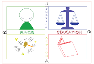
Week 8: RJEA Logo Design


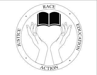
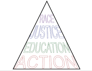
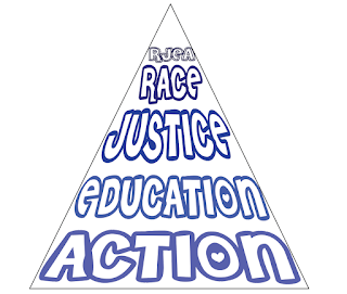
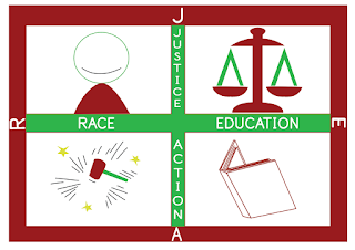
Craft: The tools I used to accomplish these 9 logos would have to be Adobe Illustrator. Within Illustrator, I used the pen tool, the color swatches, ellipse tool, rounded rectangle tool, brushes and the type tool. The first set of three logos started out from the black & white format, then moved onto a little bit of color and the last logo in the set used colors such as blue and a salmon color as I thought they went together nicely. The second set of logos started off with the simple design and a basic font that had a stroke in the type but no fill. The second logo in the set used a font off of a website that lets users use the fonts for personal use. I wanted the type in this logo to be a little crazier and out there and used different shades of blue. The third logo in this set was created with a brush tool for the outer border, a unique font and colorful letters. The third set of logos were created to represent each of the items within the title of RJEA; race, justice, education and action. I just wanted to use simple colors for the last two logos within the set because I thought it looked better simplified than extravagant.

Composition: The first set of logos were created with the ellipse tool and within the circle was another circle so that the main component of the logo was centered in the middle. The second set of logos were created with a pen tool within the shape of a triangle so that everything fit within the triangle and the viewer's eye went directly to the inside of the triangle. The third set of logos were created using the rounded rectangle tool and this time, each illustration was squared off into its own designated area within the larger rectangle. I wanted the images to be isolated because I wanted the viewer to look around the logo at each individual square instead of the whole image as one, that way they notice each illustration.
Concept: The concept behind all the logos was that we had to use the words "RJEA," which stand for race, justice, education and action. Then we were to use different fonts for each logo within a set. There were to be three different variations and within the three variations, all three versions had to be different. So I used different shapes for each variation, different fonts and colors for each versions as well. In total, we were to have 9 logos based around the concept of "RJEA."

Wednesday, February 22, 2017

Week 7: Logo Designs


Craft: The tools I used to accomplish these four logos would have to be Adobe Illustrator. Within Illustrator, I used the pen, ellipse, rounded rectangle, type, selection, direct selection and convert anchor point tool. For the first two logos, I used the rounded rectangle tool to create the shape it currently has as that was the objective for this logo. I then created a puzzle piece using the pen tool and used it in both logos. I then added a type to each logo to show the name of the object that would receive this logo, "Piece Maker." The last set of logos had to incorporate the words RJEA; race, justice, education and action, so I thought the first logo in this set should be round so I used the ellipse tool. Then I added the text around the circle and after that I created the illustration of the hands and book with the pen tool. The last logo in this set was to remain very simple. I wanted to create a logo that focused on the text and thus, I create the triangle with the pen tool and then added the text and changed the colors because my logos consisted of only black and white. 

Composition: The composition for the first logo was to expand across the whole canvas with the puzzle pieces and put the text within it. I want the viewer to look at the whole logo and not just in the center like with the second logo. The second logo mainly focuses on the design in the middle and then the expanse of black around it. I wanted this logo to be mainly in the center in counterpart to the first one in this set. The third logo was composed so that everything would be seen all at once by the viewer with a main focus on the middle part with the illustration of hands and the book. The fourth logo was composed so that the viewer had to look at the whole image instead of just one part at a time. The text seems similar in order for the viewer to read everything at once. 

Concept: The concept for the first set of logos was that it had to include the words "Piece Maker" and also be in the shape of a rounded rectangle as it was going to be adhered to a handsaw. The concept for the second set of logos was that they needed to include the words RJEA; race, justice, education and action. We could've done anything with the shape for this particular logo so I chose the ellipse and the triangle to be a major part of this logo. Other than that, both sets of logos didn't really have much restrictions as to what we could've done with them. I just wanted to play on the phrase "Piece Maker" for the first set of logos and that's why I included the puzzle pieces. I noticed that I would always get off task with my sketches and created more poster-like images rather than logos so I had to simplify the things I already sketched out for these logos. The second set of logos were probably the hardest to create something for because it gave me the freedom to do whatever but I wasn't sure how to turn those words into something logo worthy and that's how I arrived at the ellipse shape with hands and book illustration and the second logo was very simplified to see how it looked compared to the first one I created in this set. 

Wednesday, February 15, 2017

Week 6: Logos


Craft: The tools I used to create the three logos and their variations would be Adobe Illustrator. In Illustrator, I utilized the pen tool (along with its many features), brushes, color palette, grid, rulers and the layer palette. First, I traced over the original logos with the pen tool to get a handle on how to use it more fluently. Then, I changed the colors of the original logos to get a feel for how they would look with a different color scheme. The next variation on the logos utilized the different brushes within Illustrator. The brushes took the logos to the next level because it wasn't just copying the logos with a pen tool anymore, now it seemed that the logos had a new identity because they were being modified in a new way. The last group of logos were done so that they idolized a new persona. They still hold true to the original logo they came from but they were modified in a way that created an alternative logo with my ideas. 

Composition: The logos were composed in a way that drew the viewer directly to them. They were created to be best represented in the middle of the canvas on a landscape format. Since the assignment was to create a three part variation of three iconic logos, I composed the logos in the middle so that they resembled how their originals were formatted.

Concept: The idea behind the assignment was that there were suppose to be three variations of three iconic logos that we had already copied in class. The first set of logos were suppose to be modified slightly, the second set of logos were suppose to be amped up more than just changing the color scheme and the last set of logos were suppose to be the most modified set of logos and our best based on what we had learned thus far in the classroom.