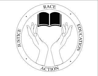
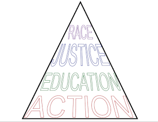
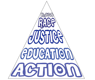
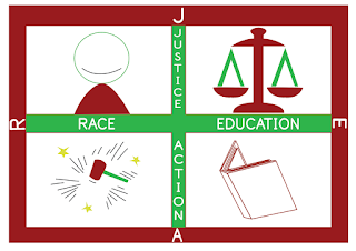
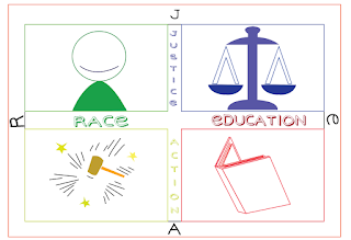
Craft: The tools I used to accomplish these 9 logos would have to be Adobe Illustrator. Within Illustrator, I used the pen tool, the color swatches, ellipse tool, rounded rectangle tool, brushes and the type tool. The first set of three logos started out from the black & white format, then moved onto a little bit of color and the last logo in the set used colors such as blue and a salmon color as I thought they went together nicely. The second set of logos started off with the simple design and a basic font that had a stroke in the type but no fill. The second logo in the set used a font off of a website that lets users use the fonts for personal use. I wanted the type in this logo to be a little crazier and out there and used different shades of blue. The third logo in this set was created with a brush tool for the outer border, a unique font and colorful letters. The third set of logos were created to represent each of the items within the title of RJEA; race, justice, education and action. I just wanted to use simple colors for the last two logos within the set because I thought it looked better simplified than extravagant.
Composition: The first set of logos were created with the ellipse tool and within the circle was another circle so that the main component of the logo was centered in the middle. The second set of logos were created with a pen tool within the shape of a triangle so that everything fit within the triangle and the viewer's eye went directly to the inside of the triangle. The third set of logos were created using the rounded rectangle tool and this time, each illustration was squared off into its own designated area within the larger rectangle. I wanted the images to be isolated because I wanted the viewer to look around the logo at each individual square instead of the whole image as one, that way they notice each illustration.
Concept: The concept behind all the logos was that we had to use the words "RJEA," which stand for race, justice, education and action. Then we were to use different fonts for each logo within a set. There were to be three different variations and within the three variations, all three versions had to be different. So I used different shapes for each variation, different fonts and colors for each versions as well. In total, we were to have 9 logos based around the concept of "RJEA."




No comments:
Post a Comment