Wednesday, February 22, 2017

Week 7: Logo Designs


Craft: The tools I used to accomplish these four logos would have to be Adobe Illustrator. Within Illustrator, I used the pen, ellipse, rounded rectangle, type, selection, direct selection and convert anchor point tool. For the first two logos, I used the rounded rectangle tool to create the shape it currently has as that was the objective for this logo. I then created a puzzle piece using the pen tool and used it in both logos. I then added a type to each logo to show the name of the object that would receive this logo, "Piece Maker." The last set of logos had to incorporate the words RJEA; race, justice, education and action, so I thought the first logo in this set should be round so I used the ellipse tool. Then I added the text around the circle and after that I created the illustration of the hands and book with the pen tool. The last logo in this set was to remain very simple. I wanted to create a logo that focused on the text and thus, I create the triangle with the pen tool and then added the text and changed the colors because my logos consisted of only black and white. 

Composition: The composition for the first logo was to expand across the whole canvas with the puzzle pieces and put the text within it. I want the viewer to look at the whole logo and not just in the center like with the second logo. The second logo mainly focuses on the design in the middle and then the expanse of black around it. I wanted this logo to be mainly in the center in counterpart to the first one in this set. The third logo was composed so that everything would be seen all at once by the viewer with a main focus on the middle part with the illustration of hands and the book. The fourth logo was composed so that the viewer had to look at the whole image instead of just one part at a time. The text seems similar in order for the viewer to read everything at once. 

Concept: The concept for the first set of logos was that it had to include the words "Piece Maker" and also be in the shape of a rounded rectangle as it was going to be adhered to a handsaw. The concept for the second set of logos was that they needed to include the words RJEA; race, justice, education and action. We could've done anything with the shape for this particular logo so I chose the ellipse and the triangle to be a major part of this logo. Other than that, both sets of logos didn't really have much restrictions as to what we could've done with them. I just wanted to play on the phrase "Piece Maker" for the first set of logos and that's why I included the puzzle pieces. I noticed that I would always get off task with my sketches and created more poster-like images rather than logos so I had to simplify the things I already sketched out for these logos. The second set of logos were probably the hardest to create something for because it gave me the freedom to do whatever but I wasn't sure how to turn those words into something logo worthy and that's how I arrived at the ellipse shape with hands and book illustration and the second logo was very simplified to see how it looked compared to the first one I created in this set. 

Wednesday, February 15, 2017

Week 6: Logos


Craft: The tools I used to create the three logos and their variations would be Adobe Illustrator. In Illustrator, I utilized the pen tool (along with its many features), brushes, color palette, grid, rulers and the layer palette. First, I traced over the original logos with the pen tool to get a handle on how to use it more fluently. Then, I changed the colors of the original logos to get a feel for how they would look with a different color scheme. The next variation on the logos utilized the different brushes within Illustrator. The brushes took the logos to the next level because it wasn't just copying the logos with a pen tool anymore, now it seemed that the logos had a new identity because they were being modified in a new way. The last group of logos were done so that they idolized a new persona. They still hold true to the original logo they came from but they were modified in a way that created an alternative logo with my ideas. 

Composition: The logos were composed in a way that drew the viewer directly to them. They were created to be best represented in the middle of the canvas on a landscape format. Since the assignment was to create a three part variation of three iconic logos, I composed the logos in the middle so that they resembled how their originals were formatted.

Concept: The idea behind the assignment was that there were suppose to be three variations of three iconic logos that we had already copied in class. The first set of logos were suppose to be modified slightly, the second set of logos were suppose to be amped up more than just changing the color scheme and the last set of logos were suppose to be the most modified set of logos and our best based on what we had learned thus far in the classroom. 

Wednesday, February 8, 2017

Week 5: Before & After Letters in Illustrator

Before
After
Craft: The tools I used to accomplish these two images would be Adobe Illustrator. For the most part I only used the pen tool, with its many options such as the add + and delete - anchor tool. I also used the direct selection tool to stretch out the curves in both the images. I integrated the rulers so that I got the same cap height, baseline and x-height amongst all the letters so that everything was consistent.

Composition: The composition was arranged so that everything basically fit on one image. The letters were resized in order for this to be accomplished.

Concept: What I was trying to achieve from this assignment would be consistency amongst basic letters that were created with the pen tool in Illustrator in the before image and in the after image I was trying to achieve letters that were modified from the before image that still possessed the consistency that was achieved from the other letters but with a twist to them using lines that intersect parts of the letters. 


Wednesday, February 1, 2017

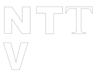
Week 4: Lettering in Illustrator


Craft: The program I used to create the letters would be Illustrator. Within Illustrator, I used the pen tool and the rulers to create the shape of the letters. The rulers helped because I set up a cap height, x-height and baseline in order to create letters that were the same height. 

Composition: I arranged the letters so that they fit on the landscape composition that we were assigned to use. I wanted the letters to fit on the canvas without having to resize each letter that was already made.

Concept: What I was trying to achieve from this lettering project would be creating the letters in the alphabet that don't have any curves in them. We learned how to use the pen tool in class but only up to a certain point for this assignment. We were just using straight and slanted lines to create the letters and therefore, the entire alphabet isn't created just yet.